type: University Client Project
responsibilities: Information Architecture, Interaction Design & Prototyping
timeframe: 7 Weeks
team: 4 Student Designers
The German Customs Structure
The Gerwerkschaft der Polizei (GDP, engl.: Police Union) approached us to visualize a new concept for the Zoll (engl.: Customs) in Germany. The Zoll system's fragmented organizational structure required a solution that would make this intricate framework understandable, while also being appealing and functional for over 200,000 potential users. Our task was to design a browser-based application that combined interactivity, clarity, and simplicity.
To tackle the project, we first had to immerse ourselves in the Zoll's structure, which is divided into two main divisions:
To tackle the project, we first had to immerse ourselves in the Zoll's structure, which is divided into two main divisions:
Mapping this complexity into a user-friendly format posed a significant challenge, especially as we needed to allow every user to explore how their specific location and role might be impacted by the proposed changes.
Coming up with an Interactive User Journey
The client envisioned a single interactive map for exploring Zoll locations and zones. While appealing, this approach proved impractical due to the sheer amount of data and required precision. Displaying all stations and commissioner offices on one map risked overwhelming users and obscuring clarity.
To resolve this, we designed a multi-step navigation system, enabling users to progress logically from a high-level Germany map down to their specific location, maintaining clarity and usability throughout.
To create a seamless user experience, we divided the navigation into manageable steps: Starting with a map of Germany, showing Zollfahndungsdirektionen or regions. Allowing users to narrow down into Zollinspektionen, then Zollkommissariate, and finally stations or criminal services.
This multi-step approach made the navigation intuitive and ensured that users could find relevant information without being overwhelmed. However, we recognized the need for an alternative navigation option for repeat users who wanted to quickly access their specific location. To address this, we implemented a multi-layer dropdown menu in the navigation bar. This dropdown displayed cities and locations in a simplified format, offering a faster way to navigate directly to specific points.
Improving Usability
Given the complexity of the system, we chose to prototype a representative user flow for the Finanzpolizei rather than visualizing every possible pathway. This allowed us to focus on refining the user experience within a manageable scope, as creating prototypes for all potential flows would have required over 90 screens.
Through hallway testing, we validated the effectiveness of the multi-step navigation system and identified the need for breadcrumbs. To further improve usability, we integrated a breadcrumb navigation system allowing users to easily move back and forth between steps without restarting their journey.
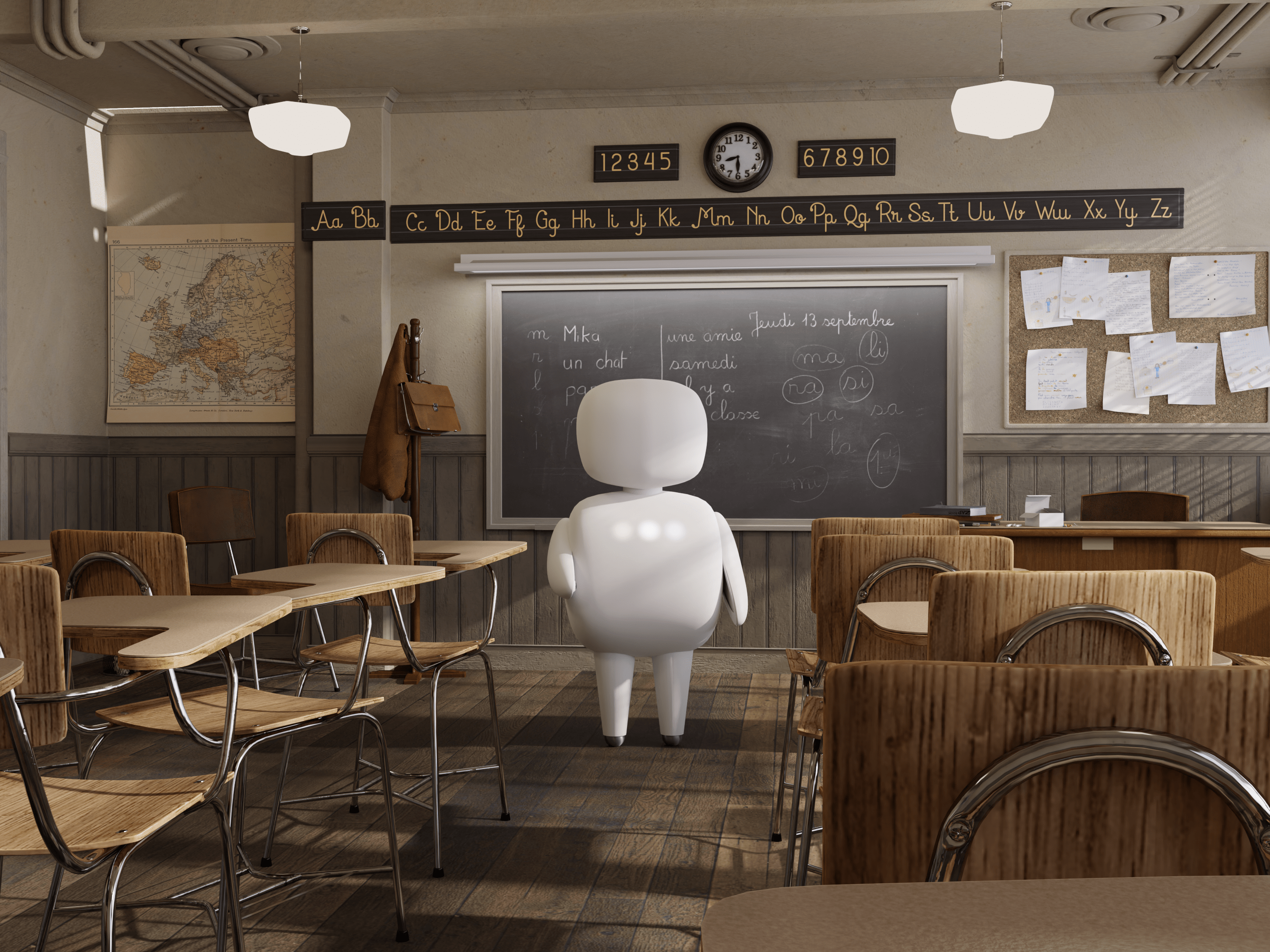
The landing page became the user’s entry point, featuring a hero image and a concise explanation of the concept. This visually engaging start invited users to dive deeper into the system.
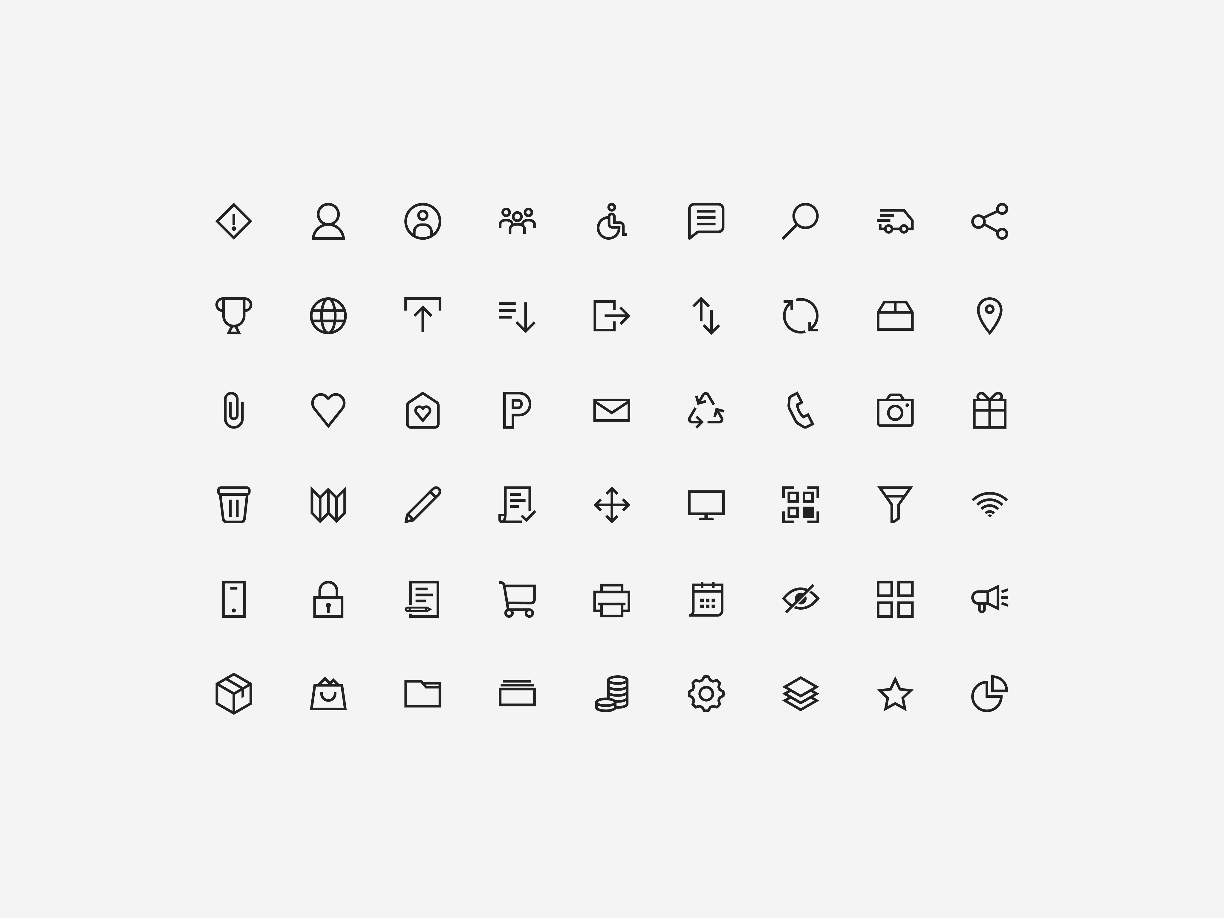
Micro-interactions with custom illustrations supported the user experience by breaking down dense information and adding moments of delight. These interactions were carefully designed to enhance understanding without overwhelming the user.




Final thoughts
The final solution successfully simplified the Zoll’s complex structure into an accessible and engaging digital experience. The multi-step navigation, combined with alternative access methods like the dropdown menu, ensured that users could explore the system at their own pace. Interactive design elements and thoughtful visual hierarchy kept the experience engaging, while the adherence to corporate design guidelines maintained professionalism.
What I learned
This project highlighted the importance of information architecture in designing user-centric solutions. By focusing on the needs of both new and returning users, we delivered a tool that balanced functionality, clarity, and aesthetic appeal. The positive client feedback confirmed that we had met the requirements while creating a scalable and intuitive framework.
Click here to take a look at the final result!
Browse the Prototype below to take a look at the wireframe.
